Style manager
Sections
The Style manager contains settings for styles and component classes. It can add padding, change the background, and more.
Also, these settings will be the first thing you see after clicking on any element.
Most elements have the following categories:
General

Determines which side the element will be aligned to. Other elements will float from other sides. When the value of the property float is none, the element is rendered on the page as usual where one line of the floating text can be on the same line as the element itself.
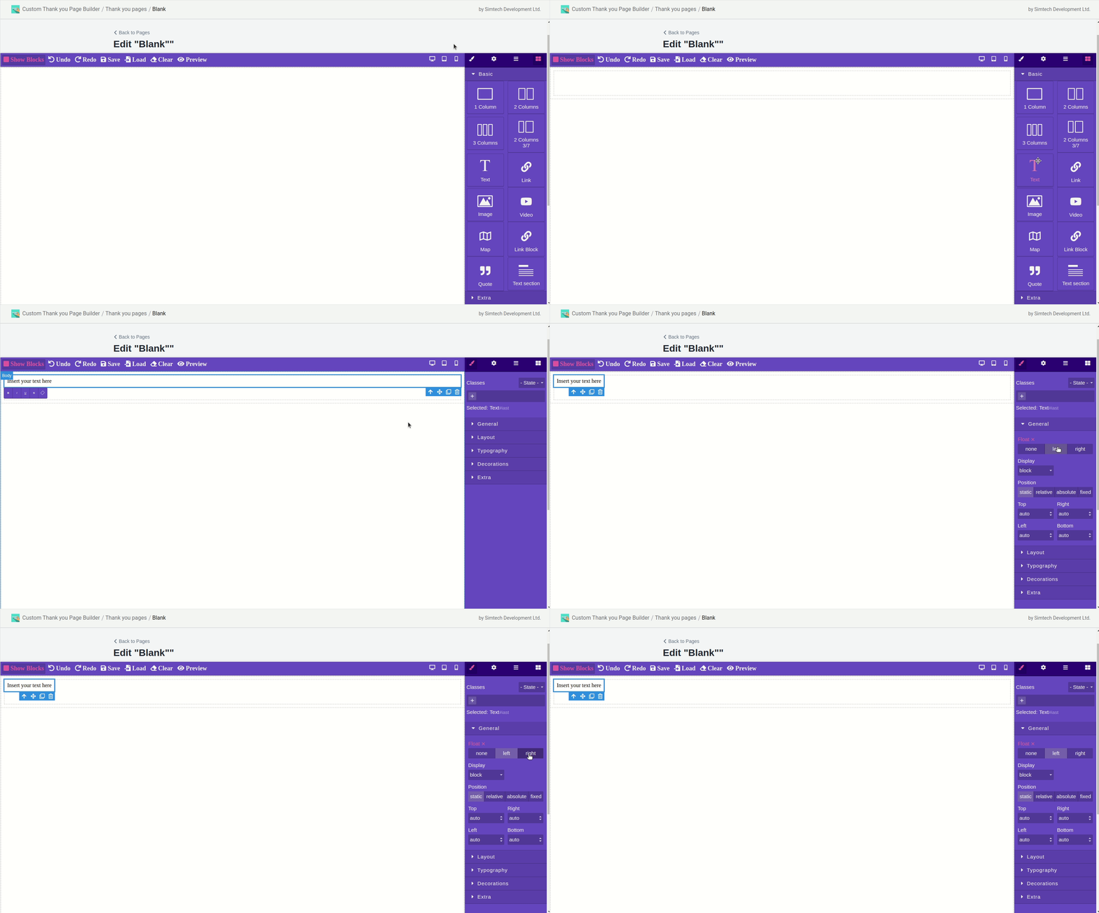
You cannot add any CSS attributes to body (the main, empty element) but you can add a background image. If you need to fill the background with color, add an empty block, stretch it to the entire page, and then fill in with the desired color.

A multipurpose property that determines how an element should be displayed in a document.
| value | description |
|---|---|
| block | The element is displayed as the block one. Applying this value to inline elements, such as tag, makes it behave like blocks — lines at the beginning and at the end of the contents are wrapped. |
| inline-block | This value generates a block element that is wrapped around by other elements of a web page like an inline element. In fact, such an element acts like inline elements (such as |
| inline | The element is displayed as inline. Using block tags such as <div> and <p> will automatically wrap and display the content of those tags on a new line. The inline value overrides this, so the content of block elements starts where the previous element left off. |
| flex | The element stretches to its full width and has its full space among the surrounding blocks. Lines break at the beginning and at the end of the block. |
| none | Temporarily removes an item from the document. The space it occupies is not reserved and the web page is rendered as if the element did not exist. You can use scripts to change the value and make the element visible again by accessing properties through the object model. In this case, the data on the page is reformatted, taking into account the newly added element. |

Sets the positioning of an element relative to the browser window or other objects on a web page.
| value | description |
|---|---|
| static | Elements are displayed as usual. Using the left, top, right, and bottom properties does not affect the display. |
| relative | The element is positioned relative to its original location. Adding left, top, right and bottom properties changes the position of the element and shifts it to one side or the other from its original position. |
| absolute | Indicates that an element is absolutely positioned. Other elements display on the web page as if there is no absolutely positioned element. The position of the element is set by the left, top, right, and bottom properties. Also, it might be affected by the position property value of the parent element. So, if the parent’s position value is set to static or there is no parent, the element coordinates are counted from the edge of the browser window. If the parent’s position value is fixed, relative, or absolute, the coordinates are counted from the edge of the parent element. |
| fixed | This value is close to absolute, The difference is that it associates with the specified left, top, right, and bottom on the screen and does not change its position when scrolling the web page. The Firefox browser does not display scroll bars at all if the position of an element is set to be fixed and does not fit entirely into the browser window. The Opera browser displays scroll bars, but they do not affect the position of the element. |
Layout

Width and height of the component.
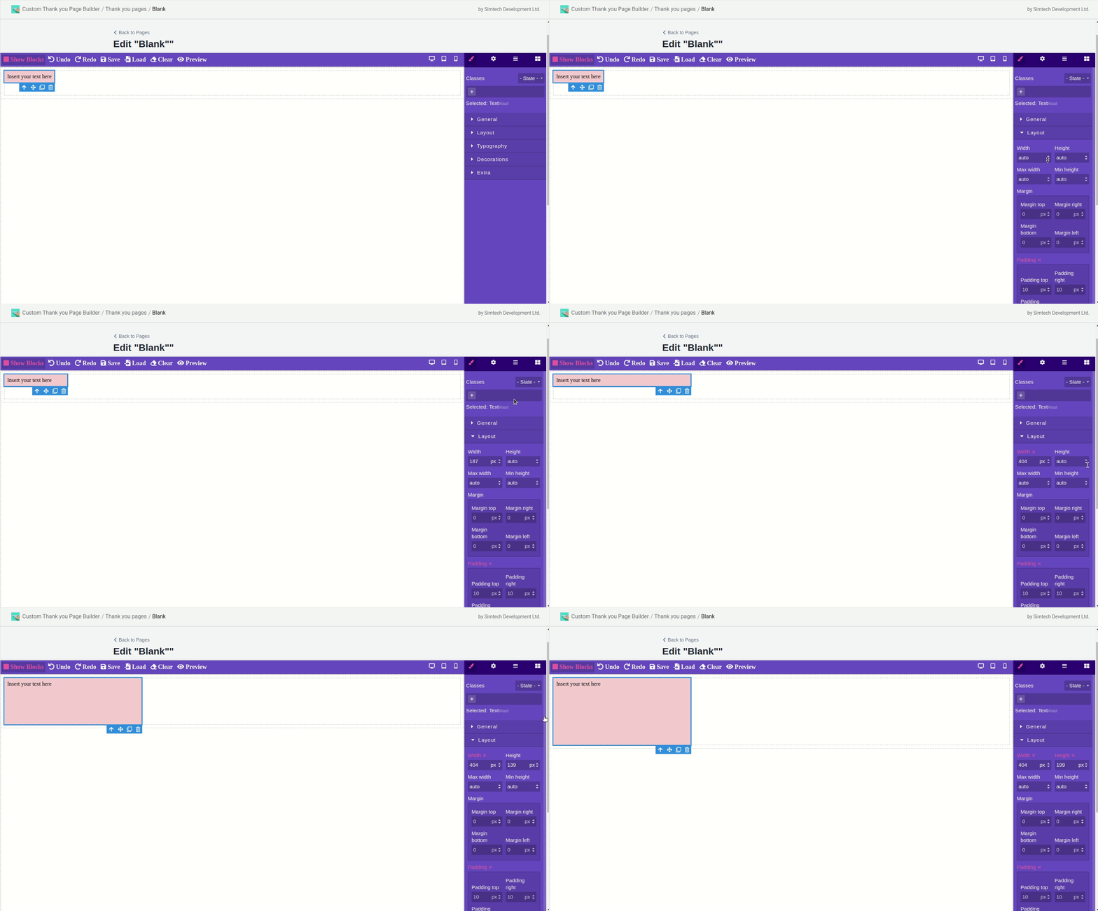

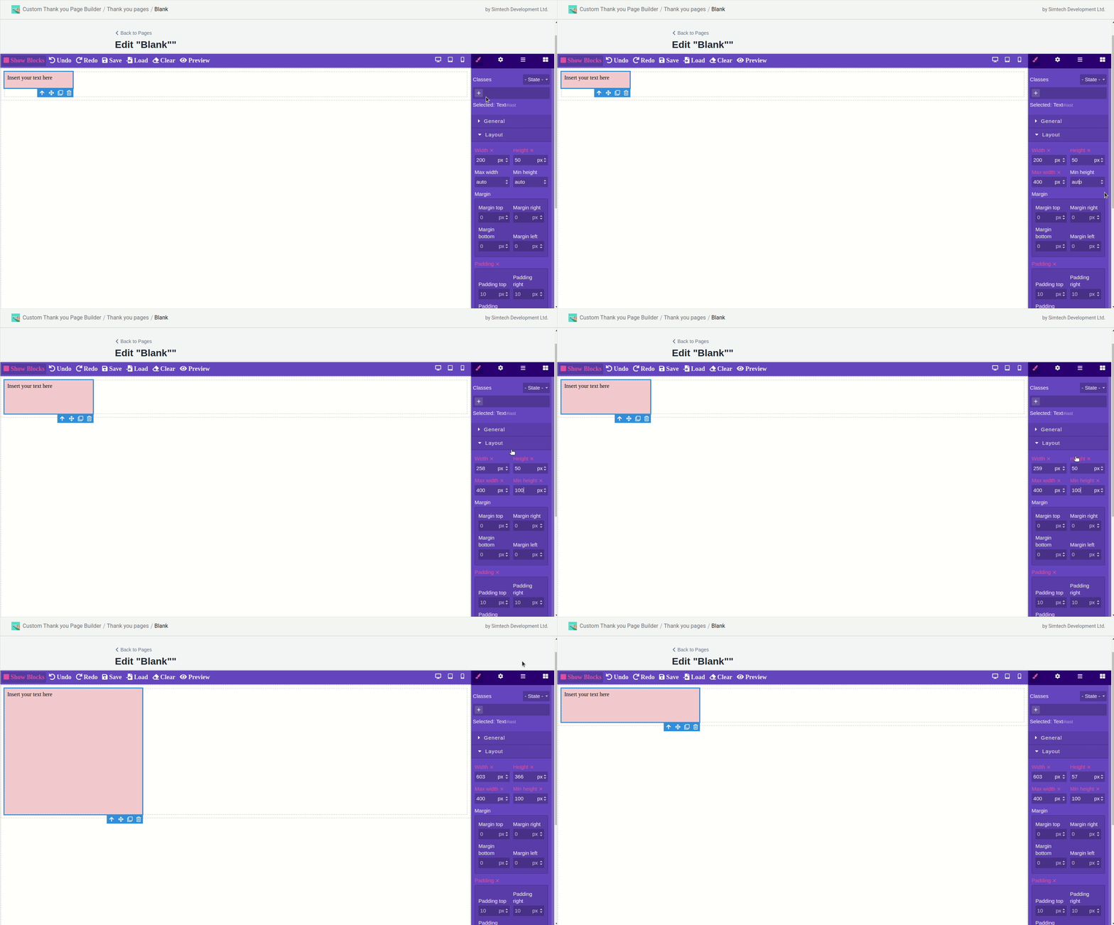
Max width and min height of the component.
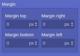
Sets the amount of margin from each edge of the element. Margin is the space from the border of the current element to the inner border of its parent.
Don’t forget about the position when changing.
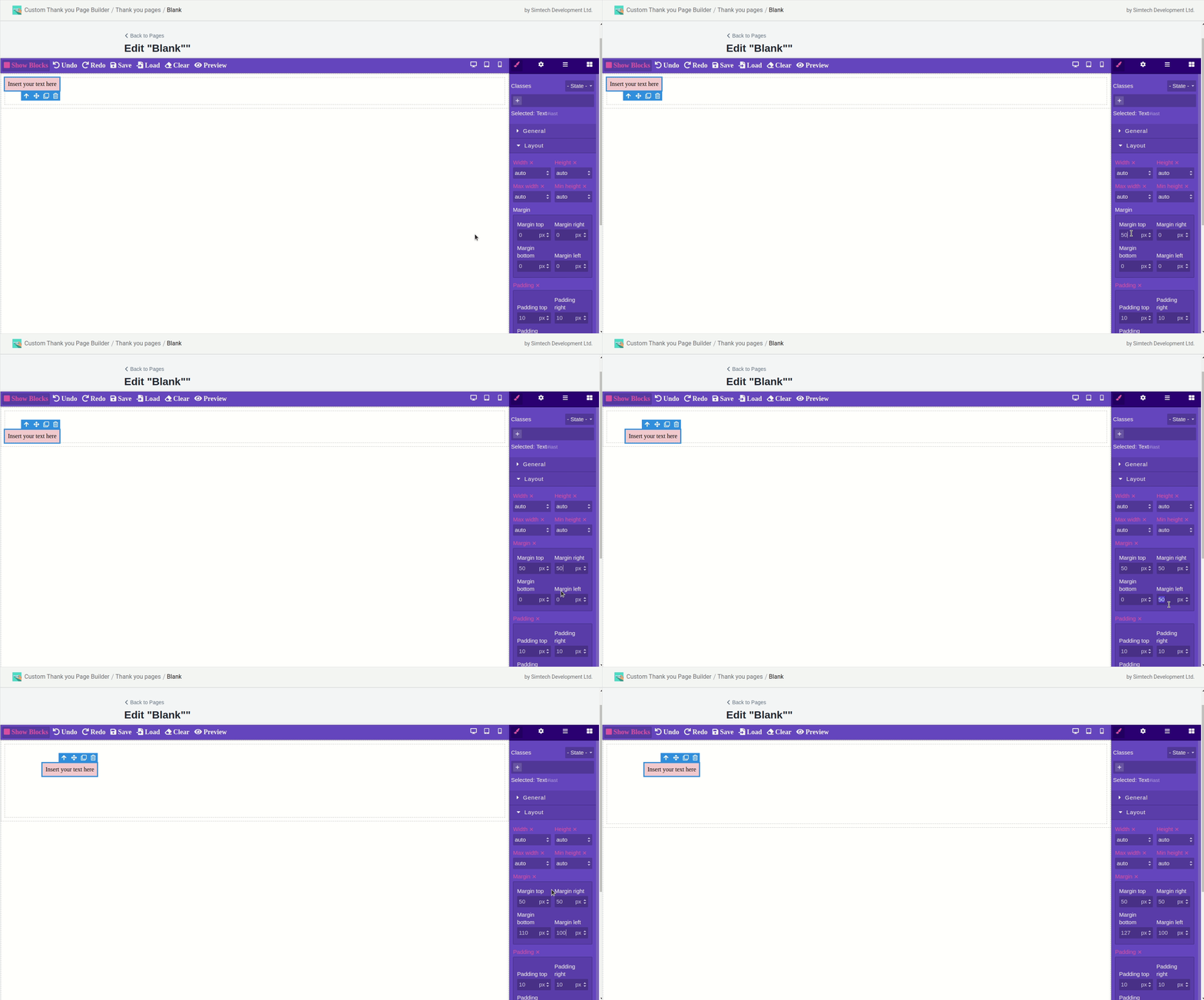
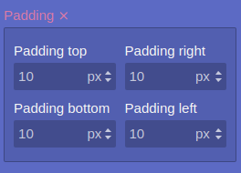
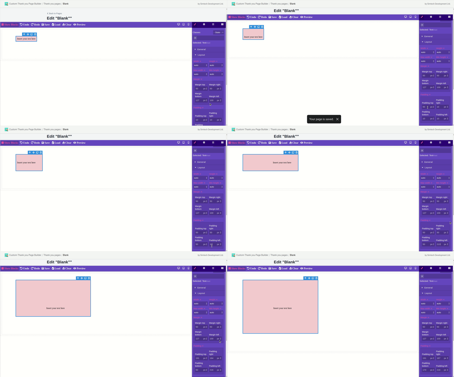
Sets the value of padding around the content of the element. Padding is the distance from the inner edge of an element’s border to an imaginary rectangle that bounds its contents.
Typography
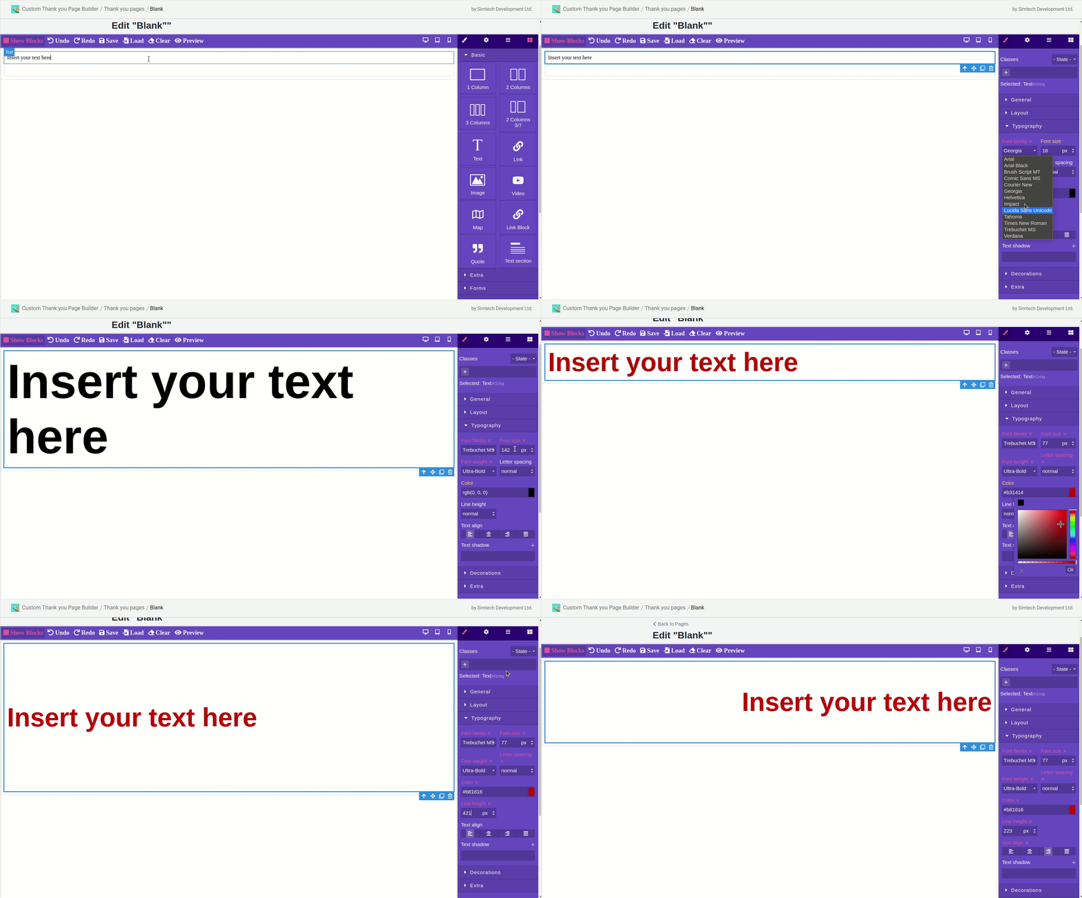
You can edit and format the text here.
Available items:
- font family and size;
- font weight;
- line spacing;
- color;
- letter spacing within an element;
- text align;
- text shadow.
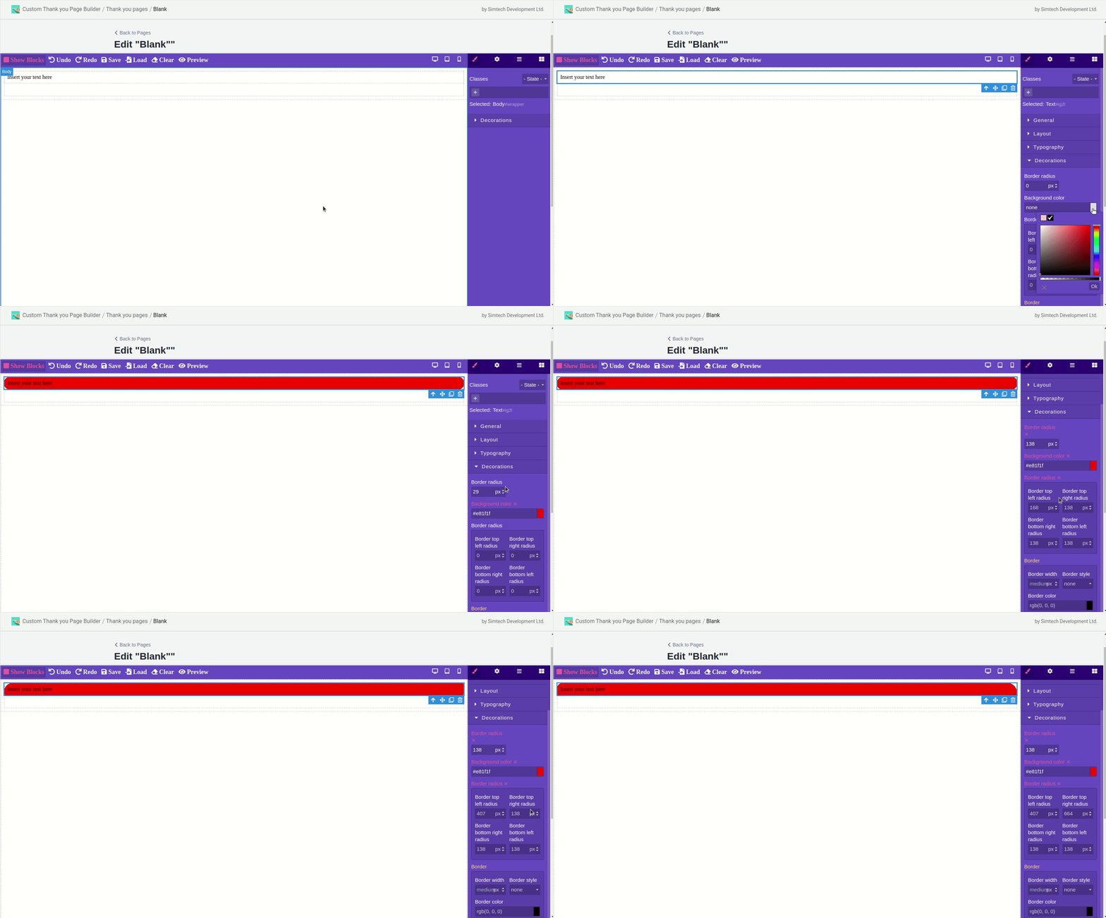
Decorations
You can edit the border on this tab.
You can change:
- radius;
- background color within the border;
- radius for each border separately. This value has higher priority than the first one;
- border color and thickness;
- box shadow;
- background with the ability to add an image.
Extra
Here you can animate the page using different states (click, hover, etc.)
You can change the following values:
transition - specify what, under what conditions and how long will be triggered;
perspective - the distance between the z = 0 plane and the user to give the 3D-positioned element a perspective effect;;
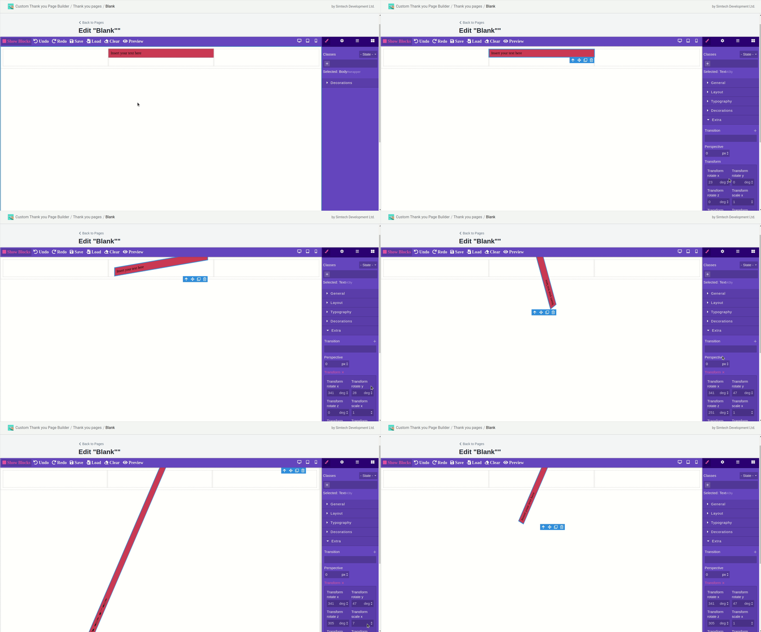
transform - the way the element will change (rotation, skew, etc.)
The example of transform:
An example of a state change on hover:
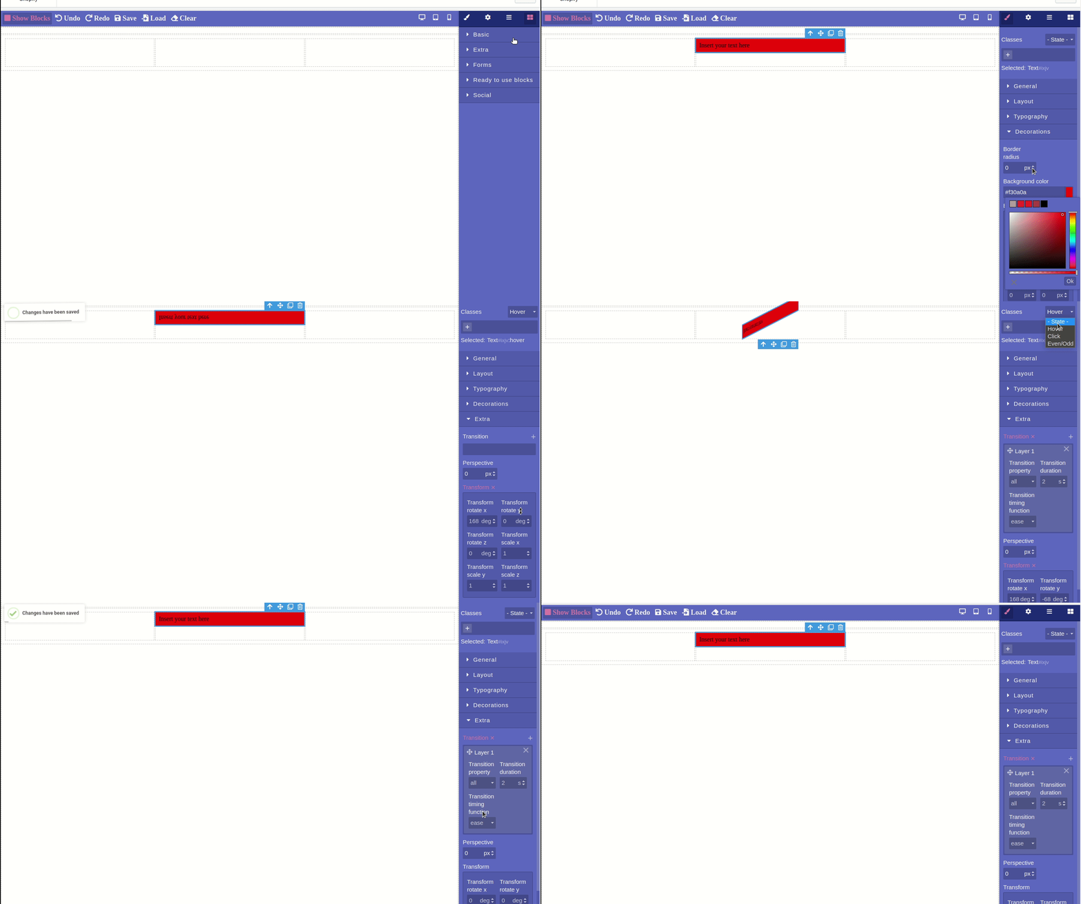
Also, each component has 4 states, where each of the above categories can be configured separately. They are:
default - default standard state;
hover - styles and settings when hovering over a component;
click - styles and settings when clicking on a component;
even\odd - used to add style to elements based on the numbering in the element tree.
A separate field is reserved for component classes:
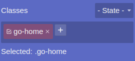
They are added automatically when importing the page.